---
title: Which Unexpected Dinnerware Color Combinations Should Restaurants Be Willing to Try?
description: tabletop trends of 2026
image: https://blog.eaton-marketing.com/hubfs/Screenshot%202026-08-05%20151546.png
---
[+1 (727) 531-0899](tel:17275310899)
-
-
-
[ ](https://eaton-smallwares.com)
- [Portfolio](https://eaton-smallwares.com/brands/)
- [Brands](https://eaton-smallwares.com/brands/)
- [Resources](https://eaton-smallwares.com/resources/)
- [About](https://eaton-smallwares.com/about/)
- [Our Story](https://eaton-smallwares.com/about/)
- [Our Team](https://eaton-smallwares.com/team)
- [Our Showrooms](https://eaton-smallwares.com/showrooms/)
- [Blog](https://blog.eaton-marketing.com/eaton-essentials-blog)
- [Contact](https://eaton-smallwares.com/contact/)
[Book Showing](https://eaton-smallwares.com/showrooms/#visit)
- [Portfolio](https://eaton-smallwares.com/brands/)
- [Brands](https://eaton-smallwares.com/brands/)
- [Resources](https://eaton-smallwares.com/resources/)
- [About](https://eaton-smallwares.com/about/)
- [Our Story](https://eaton-smallwares.com/about/)
- [Our Team](https://eaton-smallwares.com/team)
- [Our Showrooms](https://eaton-smallwares.com/showrooms/)
- [Contact](https://eaton-smallwares.com/contact/)
[Eaton Essentials](https://blog.eaton-marketing.com/eaton-essentials-blog/author/eaton-essentials) - September 09, 2026
# Which Unexpected Dinnerware Color Combinations Should Restaurants Be Willing to Try?
*A cohesive tabletop doesn't have to match.*
When designing a restaurant, it's easy to assume every plate, bowl, and mug needs to come from the same collection. While coordinated dinnerware will always have its place, today's most memorable dining experiences are embracing something different: thoughtfully mixed colors that create depth, personality, and visual interest.
The secret isn't choosing more colors, it's choosing the right ones.
[Vertex China](https://eaton-smallwares.com/brands/vertex-china/) offers collections that pair beautifully together, allowing operators to create a custom tabletop that feels intentional, elevated, and uniquely their own.
Here are three combinations we're loving right now.
---
# baby Blue + Espresso
.png?width=547&height=766&name=Untitled%20design%20(22).png)
There is something effortlessly calming about this combination.
The cool blue brings freshness and brightness, while the rich espresso brown grounds the table with warmth, creating balance without feeling overly coordinated.
This palette works especially well for:
- **-Coastal restaurants**
- **-Seafood concepts**
- **-Farm-to-table dining**
- **-Upscale brunch**
- **-Boutique hotels**
### Why it works
Instead of competing, the colors each play a significant role.
Blue adds freshness.
Espresso creates contrast.
The result feels layered rather than matched.
**Perfect for serving:**
**-Fresh seafood**
**-Pasta**
**-Seasonal vegetables**
**-Shared appetizers**
**-Artisan desserts**
*Featured:*
Vertex China London Terra Collection | [Entree Plate](https://vertexchina.com/products/entree-plate-lts-e21?_pos=14&_sid=dcb98328d&_ss=r&_fid=a1e66f217)& [Ovalado Sauce Bowl](https://vertexchina.com/products/ovalado-sauce-bowl-lts-osb?_pos=20&_sid=dcb98328d&_ss=r&_fid=a1e66f217) in *Terra Sky*
Vertex China London Terra Collection | [Rectangle Platter](https://vertexchina.com/products/rectangle-platter-ltw-r20) in*Terra White*
Vertex China Woodland Collection |[Coupe Bowl ](https://vertexchina.com/products/coupe-bowl-wl-79?_pos=2&_sid=f8c0758cd&_ss=r&_fid=ba0409475)
---
# 2. Sage + Onyx
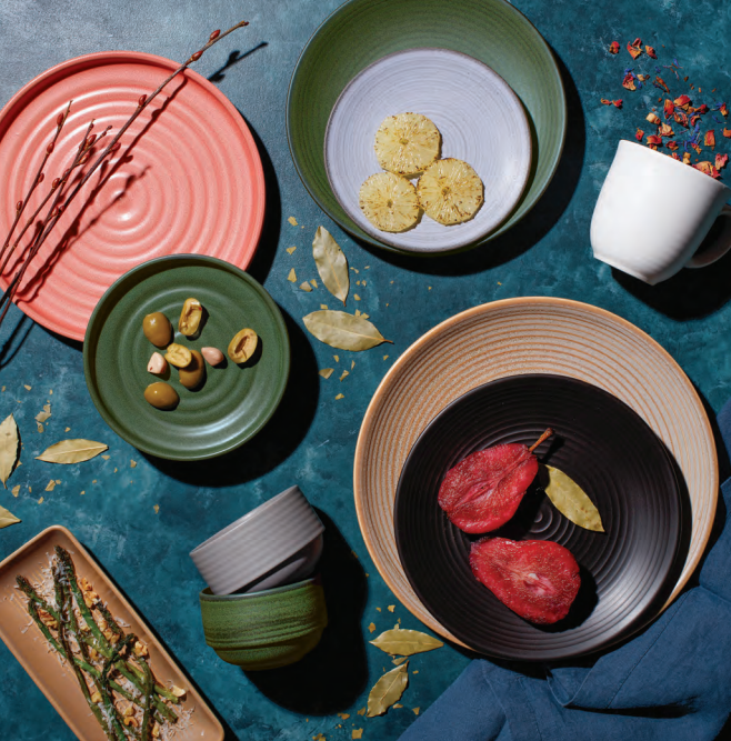
.png?width=547&height=766&name=Untitled%20design%20(23).png)
If you're looking for a combination that's modern without feeling trendy, this is it.
The muted sage offers a natural, earthy feel while black introduces drama and sophistication.
Together, they create a tabletop that feels relaxed yet elevated.
Ideal for:
**-Modern American restaurants**
**-Wine bars**
**-Steakhouses**
**-Boutique cafés**
### Why it works
Green is often associated with freshness and organic ingredients.
Black adds depth and lets colorful dishes become the focal point.
The pairing feels luxurious without trying too hard.
It's proof that subtle colors can still make a bold statement.
Featured:
Vertex China Elements Collection | [Portion Plate](https://vertexchina.com/products/portion-plate-e-207-o?_pos=17&_sid=6d6774197&_ss=r&_fid=324f236b0) in Onyx
Vertex China Orbit Collection | [Cup A.D ](https://vertexchina.com/products/cup-a-d-fits-or-36-or-35?_pos=2&_sid=dfa7964ee&_ss=r&_fid=b97fcf3a2)
Vertex China Elements Collection | [Deep Oval Bowl](https://vertexchina.com/products/deep-oval-bowl-e-b14-g?_pos=2&_sid=6149265cd&_ss=r&_fid=b0d18c963) & [Pasta/Salad Bowl](https://vertexchina.com/products/pasta-salad-bowl-e-80-g?_pos=1&_sid=0e75f0524&_ss=r) in Misty Green
---
# 3. Navy + Lavender
.png?width=547&height=766&name=Untitled%20design%20(24).png)
Cool, calming, and quietly bold, this combination offers a fresh take on monochromatic tabletop design.
Navy provides richness and confidence, while soft lavender introduces a subtle, calming contrast.
Instead of feeling overly colorful, the combination creates dimension through different tones of blue and violet.
Perfect for:
**-Contemporary restaurants**
**-Cocktail lounges**
**-Boutique hotels**
**-Upscale cafés**
**-Dessert concepts**
### Why it works
Monochromatic palettes don't have to mean using one color.
Working within neighboring hues creates interest while maintaining a cohesive overall look.
The darker pieces naturally frame the lighter dinnerware, allowing every course to stand out.
Featured:
Vertex China Elements Collection | Stacking Plate in [Blue Fog](https://vertexchina.com/products/stacking-plate-e-d16-f?_pos=3&_sid=caa5e99e0&_ss=r&_fid=5c8e31d70) & [Violet](https://vertexchina.com/products/stacking-plate-e-d16-v)
Vertex China Elements Collection | [Gourmet Bowl](https://vertexchina.com/products/gourmet-bowl-e-g23-f?_pos=19&_sid=caa5e99e0&_ss=r&_fid=5c8e31d70) in Blue Fog
Vertex China Vista Collection | [Summit Stackable Mug](https://vertexchina.com/products/summit-mug-stackable-cobalt-blue-sm-cb?_pos=1&_sid=6c39f0946&_ss=r&_fid=6f6e98cab) in Cobalt Blue
---
# The New Rule? There Really Aren't Any.
Today's restaurant tabletops are less about matching and more about storytelling.
Mixing collections allows operators to:
-Create visual depth
-Highlight signature dishes
-Differentiate meal courses
-Add personality without overwhelming the table
-Refresh an existing tabletop without replacing every piece
*When done intentionally, unexpected color combinations often feel more curated than a perfectly matched set.*
That's where Vertex China shines. Their collections offer finishes, textures, and color palettes that complement one another, giving designers and operators the freedom to create a tabletop that's uniquely theirs.
Whether you're designing a new concept or refreshing an existing one, don't be afraid to experiment. Sometimes the best combinations are the ones you never expected.
---
## Need Help Creating the Perfect Tabletop?
At Eaton Essentials, we help operators build tabletops that reflect their concept, from dinnerware and glassware to flatware and serving pieces.
Whether you're opening a new restaurant or updating your current look, our team can help you mix collections, compare styles, and build a tabletop that's both functional and unforgettable.
**Let's create something guests will remember.**
---
## FAQ
### Is it okay to mix different dinnerware collections?
Absolutely. Mixing collections is one of today's biggest tabletop trends. The key is choosing colors, textures, and shapes that complement each other rather than trying to match everything exactly.
### Will mixed dinnerware look inconsistent?
Not if it's done intentionally. Repeating colors, finishes, or shapes throughout the tabletop creates cohesion while still adding visual interest.
### What restaurants benefit most from mixed tabletop collections?
Nearly every concept can benefit—from upscale dining and boutique hotels to cafés, wine bars, seafood restaurants, and modern casual concepts.
### Can I mix matte and glossy finishes?
Yes. Combining finishes creates texture and dimension. Matte pieces often provide contrast that helps glossy glazes and plated food stand out.
### How do I know which collections work together?
Our team can help curate combinations based on your restaurant's concept, menu, branding, and atmosphere so your tabletop feels cohesive from the first course to dessert.
[Trends](https://blog.eaton-marketing.com/eaton-essentials-blog/tag/trends), [tabletop](https://blog.eaton-marketing.com/eaton-essentials-blog/tag/tabletop)
## Read On
[](https://blog.eaton-marketing.com/eaton-essentials-blog/top-tabletop-trends-defining-restaurants-in-2026-part-1)
### [Top Tabletop Trends Defining Restaurants in 2026 (Part 1)](https://blog.eaton-marketing.com/eaton-essentials-blog/top-tabletop-trends-defining-restaurants-in-2026-part-1)
Restaurant design is constantly evolving, and in 2026, tabletop is doing more than simply holding a...
[](https://blog.eaton-marketing.com/eaton-essentials-blog/faces-of-hospitality-meet-katie-connelly)
### [Faces of Hospitality: Meet Katie Connelly, Director of National Accounts at Mikasa Hospitality](https://blog.eaton-marketing.com/eaton-essentials-blog/faces-of-hospitality-meet-katie-connelly)
Welcome to Faces of Hospitality, a new series from Eaton Essentials celebrating the people who make...
[-1.png?width=352&name=WIL%20(4)-1.png)](https://blog.eaton-marketing.com/eaton-essentials-blog/faces-of-hospitality-meet-jason-daigle)
### [Faces of Hospitality: Meet Jason Daigle, Vice President & Co-Founder of Eaton Essentials](https://blog.eaton-marketing.com/eaton-essentials-blog/faces-of-hospitality-meet-jason-daigle)
Welcome to Faces of Hospitality, a new series from Eaton Essentials celebrating the people who make...

**More Than A Partner.**
Ensuring your streamline hospitality experience.
## About
- [Our Story](https://eaton-smallwares.com/about/#our-story)
- [Our Team](https://eaton-smallwares.com/team)
- [Our Brands](https://eaton-smallwares.com/brands)
## Solutions
- [Cleaning & Sanitation](https://eaton-smallwares.com/product_type/cleaning-sanitation/)
- [Countertop Appliances](https://eaton-smallwares.com/product_type/countertop-appliances/)
- [Disposables](https://eaton-smallwares.com/product_type/disposables/)
- [Faucets & Plumbing](https://eaton-smallwares.com/product_type/faucets-plumbing/)
- [Furniture](https://eaton-smallwares.com/product_type/furniture/)
- [Glassware & Barware](https://eaton-smallwares.com/product_type/glassware-barware/)
- [Mobile Merchandising & Serving](https://eaton-smallwares.com/product_type/mobile-merchandising-serving/)
- [Tabletop](https://eaton-smallwares.com/product_type/tabletop/)
## Contact
- [General Inquiry](https://eaton-smallwares.com/contact/)
- [Book A Showroom Visit](https://eaton-smallwares.com/showrooms/#visit)
© 2026 Eaton Essentials
-
-
-
```json
{
"@context" : "https://schema.org",
"@type" : "BlogPosting",
"author" : {
"@type" : "Person",
"name" : "Eaton Essentials",
"url" : "https://blog.eaton-marketing.com/eaton-essentials-blog/author/eaton-essentials"
},
"dateModified" : "2026-09-09T19:07:43.188Z",
"datePublished" : "2026-09-09T18:58:15.000Z",
"headline" : "Which Unexpected Dinnerware Color Combinations Should Restaurants Be Willing to Try?",
"image" : [ "https://blog.eaton-marketing.com/hubfs/Screenshot%202026-08-05%20151546.png" ],
"mainEntityOfPage" : {
"@id" : "https://blog.eaton-marketing.com/eaton-essentials-blog/unexpected-pairings",
"@type" : "WebPage"
},
"publisher" : {
"@type" : "Organization",
"logo" : {
"@type" : "ImageObject",
"url" : "https://blog.eaton-marketing.com/hubfs/423436_EatonMarketingLogo_050819_34.png"
},
"name" : "Eaton Marketing"
}
}
```